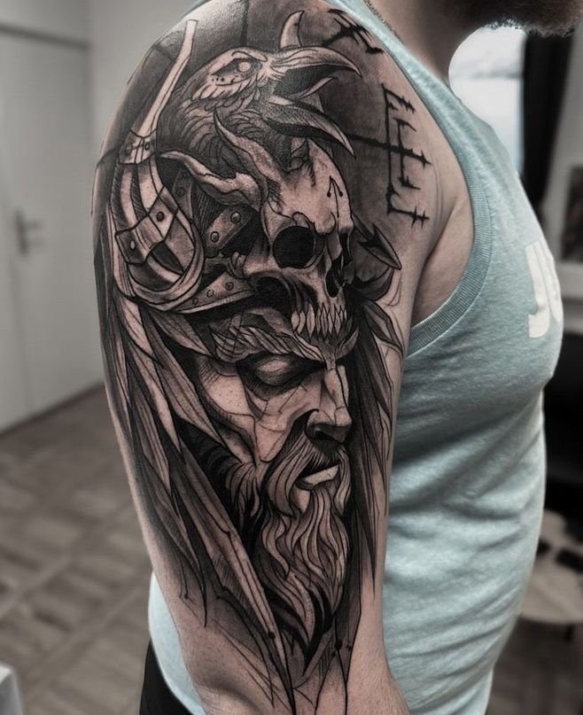
The shoulder blade sits in a rare sweet spot on the body. It is broad enough to hold real artwork, curved enough to give a design movement, and private enough that the wearer decides when it gets seen.
That combination is why shoulder blade tattoos have quietly become one of the most requested upper back placements in modern studios. A design here reads as confident without shouting, which is exactly the “effortlessly bold” look so many people are after.
This guide walks through eleven distinct shoulder blade tattoo ideas, from whisper-thin fine line work to heavy blackwork statements. Each one covers how the design looks on the body, which styles suit it, and how it can be adapted to different tastes and budgets.
Alongside the inspiration, there are practical notes on sizing, pain, healing, and choosing an artist, because a great concept only works when it is planned for the body part it lives on.
Why the Shoulder Blade Is Such a Strong Tattoo Placement
The scapula gives artists something they rarely get elsewhere: a mostly flat surface with a natural frame. The bone creates a soft triangular shape under the skin, and a well-planned tattoo can sit inside that shape instead of fighting it.
Movement is the second advantage. When the arm lifts or rotates, the skin shifts slightly, giving wings, waves, and animal designs a sense of life that a static area like the outer thigh cannot match.
There is also the practical side. Shirts, dresses, and work clothes cover the area completely, so a shoulder blade tattoo can be hidden for a job interview and revealed with an open-back top the same week.
Finally, the upper back gets less daily sun and friction than hands, forearms, or feet. With sensible aftercare, tattoos here tend to hold their crisp lines and shading for years.
1. Fine Line Botanical Branch
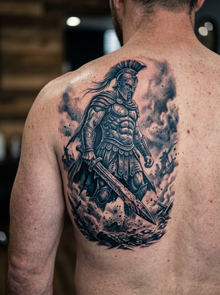
A single stem of eucalyptus, olive leaves, wildflowers, or lavender traced down the blade is one of the most popular minimalist shoulder blade tattoos in circulation right now.
The design works because a branch is naturally long and slightly curved, which mirrors the slope from the shoulder toward the spine. The eye follows the stem downward, making the back look longer and more elegant.
Fine line and single-needle styles suit this idea best. Thin, consistent linework keeps the piece delicate, while light stippled shading on a few leaves adds depth without turning it heavy.
Symbolically, botanicals are flexible. Olive branches suggest peace, lavender is often linked to calm and healing, and wildflowers tend to represent resilience and growth in unplanned places.
Most botanical blade pieces run four to seven inches tall and sit beautifully as a first tattoo. They lean feminine in the way they are usually drawn, though a bolder line weight and a sharper plant like thistle shifts the whole feel toward unisex.
Customisation is simple here. Swapping the plant for a birth flower, adding a second smaller sprig on the opposite blade, or extending the stem toward the shoulder cap all change the piece without changing the concept.
2. Ornamental Mandala Anchored on the Blade
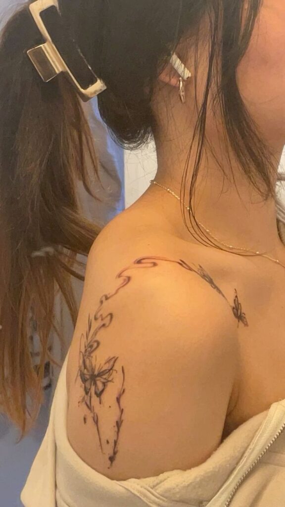
An ornamental mandala uses repeating geometric petals radiating from a central point, often softened with dotwork shading and fine filigree edges.
This design belongs on the shoulder blade more than almost anywhere else, because the flattest part of the scapula gives the circle a stable base. A mandala placed over a curved or bony area distorts, while one centred on the blade stays symmetrical.
Dotwork, blackwork, and ornamental styles all suit the concept. Artists frequently soften the lower edge so the pattern fades into the skin instead of stopping with a hard outline, which keeps the piece from looking like a sticker.
Mandalas carry meanings of balance, focus, and wholeness across several traditions, though plenty of wearers choose them purely for the geometry and the way the symmetry sits on the body.
Sizing is important. A mandala under four inches loses its detail as it ages, so most artists recommend five to eight inches for a design with fine internal linework.
For something bolder, the pattern can trail into a half sleeve of ornamental lace across the shoulder. For something quieter, a half mandala tucked at the top of the blade offers the same visual language at a fraction of the commitment.
3. Blackwork Wing or Feather Fan
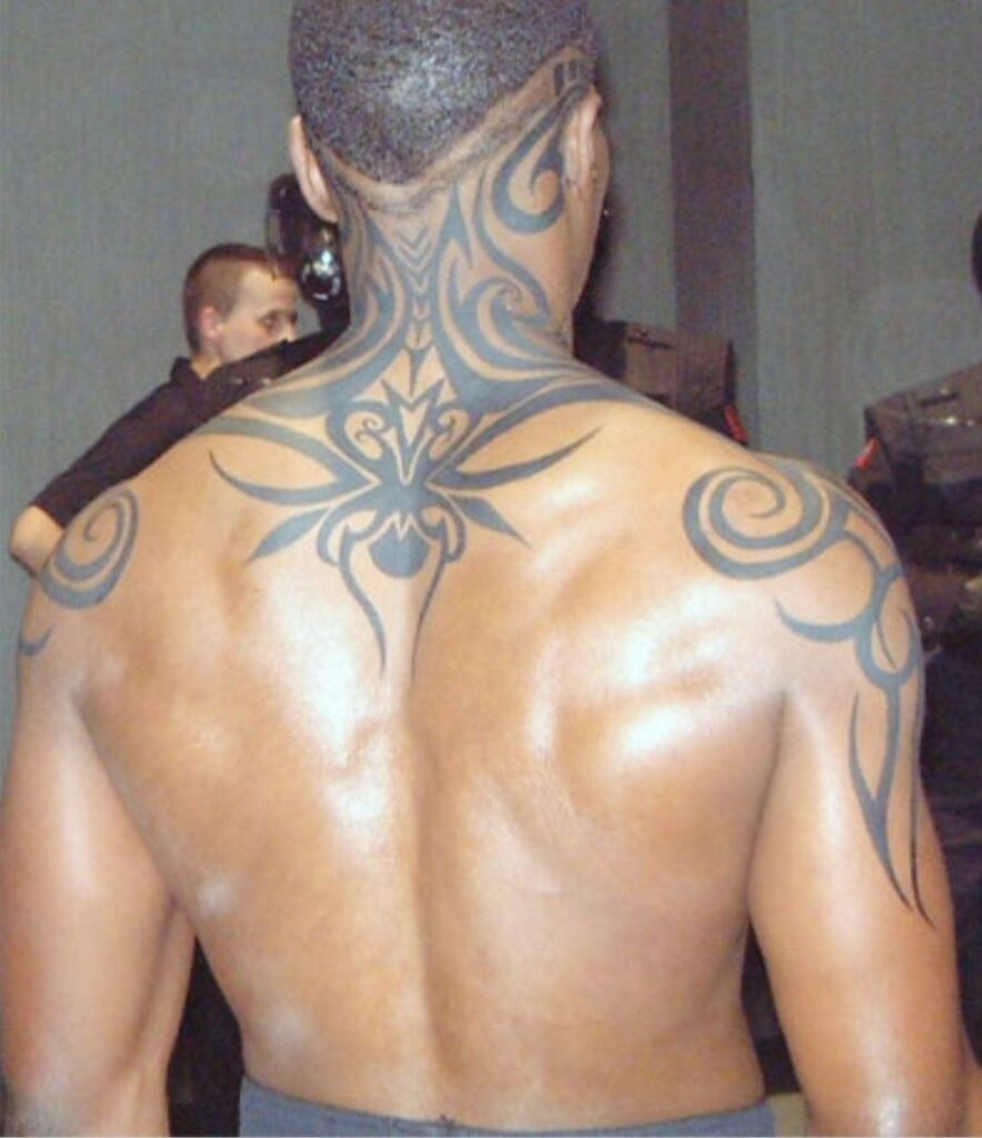
Wings are an obvious upper back subject, and the shoulder blade is the exact spot where they would sprout anatomically, which is why the placement feels so natural.
A modern take avoids the dated full-back angel wing look. Instead, a single wing or a fan of layered feathers covers one blade, rendered in heavy blackwork with solid fills and sharp negative space.
Blackwork, neo-traditional, and etching-style linework all handle feathers well. Solid black ages more predictably than fine grey wash, so a bold-fill wing will still read clearly in a decade.
Meaning ranges widely. Wings are commonly tied to freedom, protection, and remembrance, and many wearers choose a single wing as a tribute rather than a matched pair.
This idea reads masculine or unisex depending on execution. Broad, angular feathers with heavy black feel strong and graphic, while longer, softer plumes with open spacing read gentler.
A single wing usually needs six to nine inches of height to look intentional. Shrinking it much smaller tends to blur the feather separation, which is the detail that makes the design work.
4. Bird Caught Mid-Flight
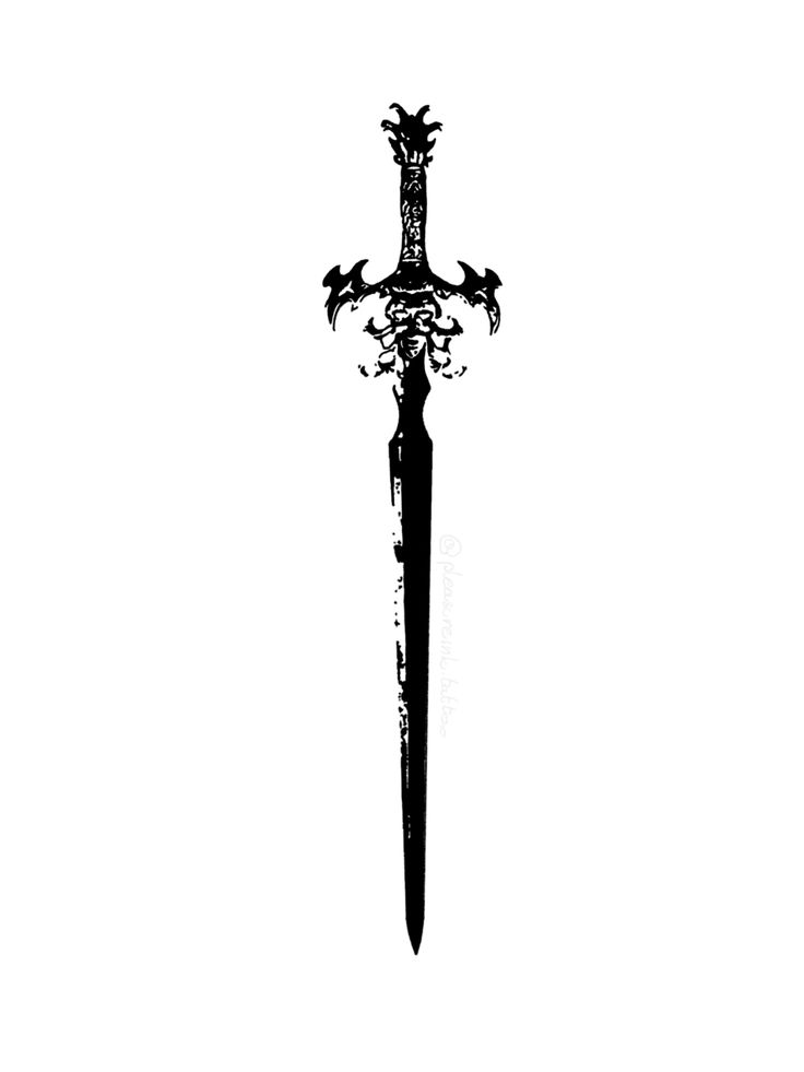
A bird rendered in motion is one of the most effective ways to use the movement of the upper back. Swallows, cranes, hawks, and ravens all work, and each brings a different mood.
The trick is placement. When the bird sits with its wings angled toward the spine, arm movement subtly shifts the design and the illusion of flight becomes stronger.
Style choice changes the piece dramatically. Traditional American swallows bring bold outlines and flat colour, black-and-grey hawks lean realistic and dramatic, and a single-line crane feels quiet and modern.
Birds carry some of the oldest tattoo symbolism there is: swallows with safe return and loyalty, cranes with longevity and grace, ravens with intelligence and transformation.
A small single bird can sit at three to four inches near the top of the blade. A detailed realistic bird with feather texture and shading generally needs six inches or more to hold its detail.
Wearers often personalise this idea with what the bird carries or releases, such as a key, a small branch, or a scattering of petals drifting toward the spine.
5. Micro Constellation and Celestial Map
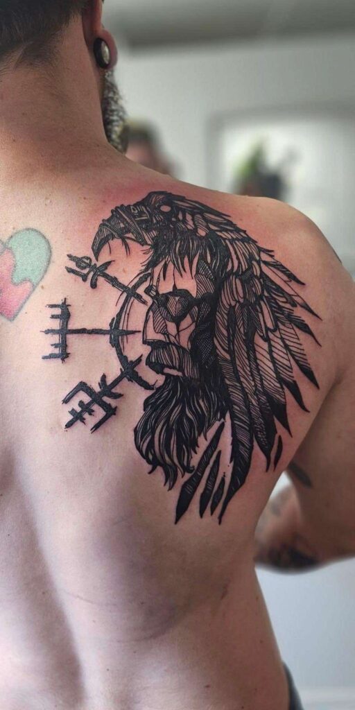
Celestial designs have moved well past the tiny wrist star. On the shoulder blade, a constellation can be drawn to scale, with varied dot sizes for star brightness and hairline connecting lines.
The blade suits this because the stars need breathing room. Spread across five or six inches of upper back, the pattern reads as a night sky rather than a cluster of random dots.
Fine line and dotwork are the natural styles. Some artists add a faint grey wash behind the stars to suggest deep space, though the cleanest versions keep the skin itself as the background.
Meaning tends to be personal rather than universal. Many people choose a birth constellation, the sky on a significant date, or a zodiac pattern tied to someone they love.
This is one of the strongest options for readers who want something meaningful but understated, sitting comfortably in minimalist territory while still covering a decent area of skin.
Those drawn to small symbolic pieces close to the body may also find useful inspiration in these small chest tattoo ideas with deep meaning, which follow a similar quiet-but-personal approach.
A quick word of caution: very tiny dots can soften over time. Asking the artist for slightly larger star points is the difference between a design that stays sharp and one that fades into freckles.
6. Japanese-Inspired Wave, Koi, or Peony Panel
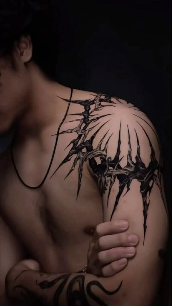
Traditional Japanese tattooing was built around large body panels, and the shoulder blade is a natural starting block for that approach.
A koi swimming upward through stylised waves, a peony framed by wind bars, or a small dragon curling around the blade all use the same visual logic: bold outlines, structured background, and strong flow.
The style rewards size and space. Irezumi-influenced work relies on background elements like waves, clouds, and wind to give the main subject movement, and those elements need room to breathe.
Symbolism in this tradition is well defined. Koi are associated with perseverance and swimming against the current, peonies with bravery and prosperity, and waves with the constant push of life.
Because the design is built in panels, it can stay contained on one blade or later extend into a half back or shoulder-to-chest piece. Artists often plan the outer edges with future expansion in mind even when the client only wants one section.
Expect a larger time commitment. A properly shaded Japanese blade panel usually needs eight inches or more and several hours of work, often split across sittings.
7. Script, Quote, or Single Word Along the Blade
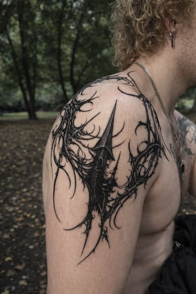
Lettering placed along the upper edge of the shoulder blade follows the natural line of the bone, which makes even a short phrase look deliberate.
Script works here because the area is flat and the skin does not fold. Text on a ribcage or inner arm can distort with movement, while text on the blade holds its shape.
Font choice does most of the heavy lifting. Delicate handwritten script reads soft and feminine, blackletter feels heavy and gothic, and clean serif capitals look quiet and modern.
Many wearers choose a family name, a date in Roman numerals, a line of lyrics, or a single word acting as a personal reminder. Short phrases almost always age better than long ones.
Placement has two popular options. Curved along the top of the blade, the text follows the shoulder line. Running vertically toward the spine, it reads more like a spine tattoo and feels more dramatic.
One practical note: thin script letters placed too close together tend to blur as ink settles over the years. Slightly wider spacing and a mid-weight font protect the legibility of the piece long term.
8. Watercolour Abstract in Motion
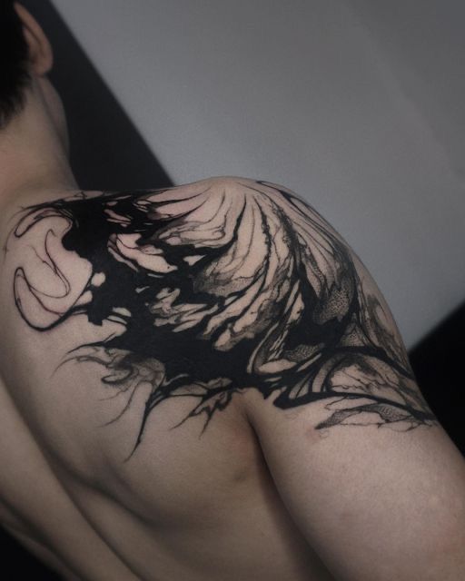
Watercolour tattoos mimic paint on paper, with soft colour bleeds, splashes, and edges that fade rather than stop. On the shoulder blade, that softness has somewhere to travel.
A typical composition anchors a subject, such as a bird, flower, or geometric shape, then lets colour spill diagonally toward the spine, as though gravity pulled the pigment across the back.
The style suits people who want colour without the flat, graphic look of traditional tattooing. Blues and teals feel calm, warm oranges and pinks feel energetic, and a single accent colour over black linework is the most conservative version.
Watercolour has a reputation for fading, and that reputation is only partly fair. Pieces built over a strong black or grey structure hold up well, while purely pigment-based splashes with no anchoring linework soften faster.
Because the upper back sees limited sun compared with arms and legs, it is actually one of the better placements for colour work, provided sunscreen becomes a habit.
Sizing usually starts around five inches, since the splash effect needs space to look intentional rather than accidental.
9. Black-and-Grey Animal Portrait
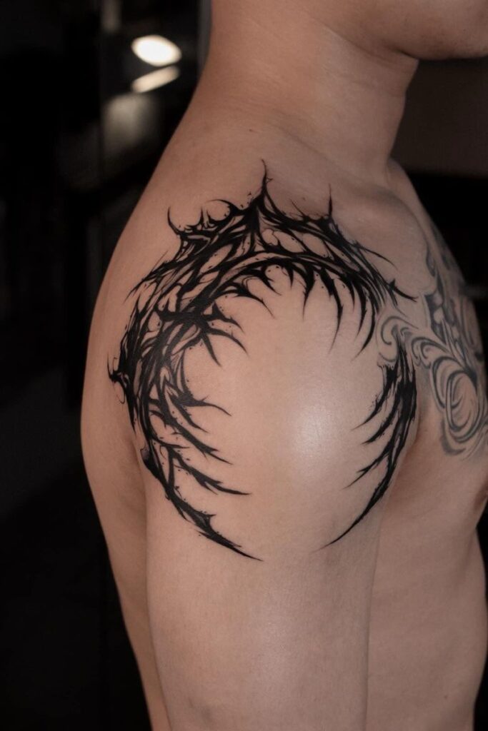
A realistic animal portrait turns the shoulder blade into a focal point. Wolves, lions, tigers, stags, and horses are the most requested subjects, generally rendered in black-and-grey realism.
Realism needs a flat, generous canvas, and the blade provides exactly that. Portraits placed over rounded areas such as the shoulder cap can warp, while a portrait centred on the scapula stays proportionate.
This is where artist selection matters most. Smooth gradients, accurate anatomy, and controlled contrast separate a striking portrait from a muddy one, and not every talented artist specialises in realism.
Symbolism usually reflects the qualities of the animal, from the loyalty and pack instinct associated with wolves to the courage and authority linked with lions.
Portraits read bold by nature and are popular among readers looking for masculine upper back tattoo ideas, though softer subjects like deer, hares, or birds shift the tone considerably.
Plan for size and time. A convincing animal portrait rarely works under six inches, and detailed pieces often take two sessions with a healing gap in between.
10. Mirrored Designs Across Both Shoulder Blades
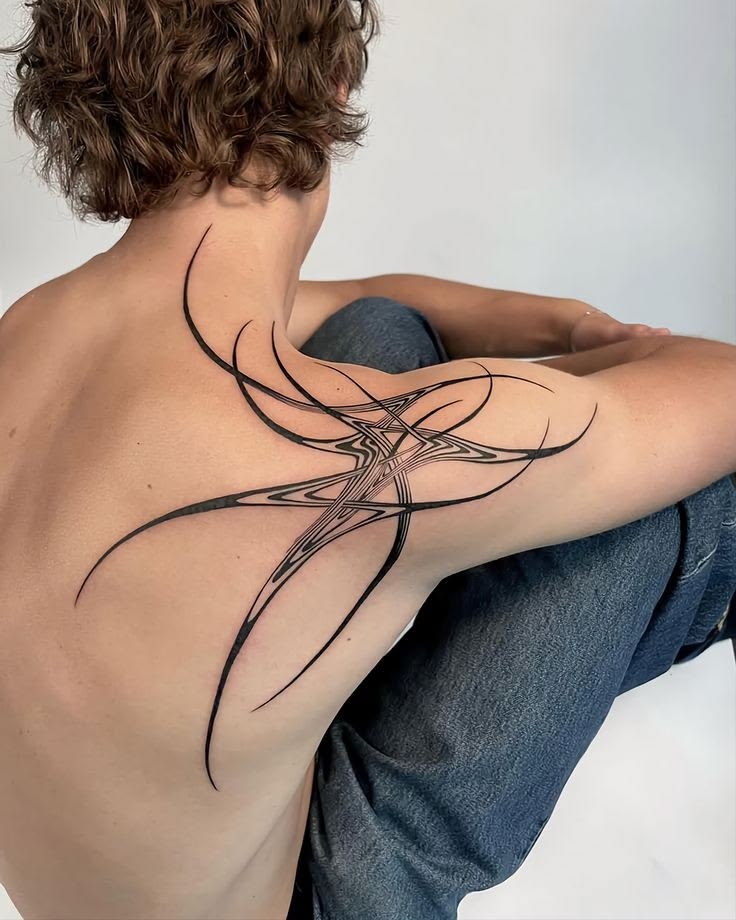
Rather than filling one blade, this idea places two complementary designs on either side of the spine, using the body’s natural symmetry as part of the composition.
Common pairings include two moths, matching floral sprigs, opposing geometric shapes, or a sun on one side and a moon on the other. The gap down the centre is part of the design, not empty space.
Symmetry is the whole point, so the stencil stage takes longer than usual. Careful measuring against the spine and shoulders is what stops one side from sitting visibly higher than the other.
The concept adapts to almost any style. Fine line mirrored botanicals feel delicate, while two bold blackwork shapes create a striking graphic effect across the upper back.
Meaning often comes from duality: light and dark, past and present, or two people, places, or dates held in balance. Some wearers use the pairing to represent two children or two chapters of life.
This approach also splits well across sessions. One blade can be completed first, with the mirrored side added later once the wearer is confident in the style and the artist.
11. Wrap-Around Serpent, Vine, or Ribbon
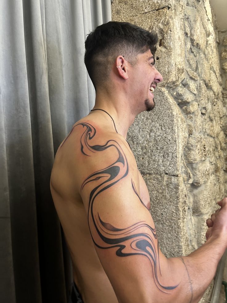
The most three-dimensional option on this list starts on the shoulder blade and travels, curling over the shoulder cap toward the collarbone or reaching down toward the underarm.
A snake is the classic choice, since its natural coil suits a body that curves. Climbing vines, ivy, ribbons, and chains follow the same logic with a softer visual result.
The design rewards a careful stencil. Because the piece crosses a joint, the artist needs to check placement with the arm both raised and lowered so the shape flows in every position.
Snakes carry layered symbolism across cultures, commonly tied to transformation, rebirth, and protection, while vines lean toward growth, endurance, and connection.
Styles vary widely. Blackwork snakes feel sharp and modern, neo-traditional versions add colour and decorative detail, and fine line vines stay understated despite the large area covered.
This is the idea with the widest scope. It can stay modest at seven or eight inches, or grow into a full shoulder and upper back piece over time, which is why it is a favourite among people planning long-term collections.
Fandom-led designs adapt well to this wrap-around logic too, with emblems, crests, and character motifs flowing over the shoulder rather than sitting flat. Readers who enjoy that approach can explore these One Piece anime tattoo ideas for examples of how illustrative themes translate onto the body.
How to Choose the Right Shoulder Blade Tattoo
With eleven directions on the table, narrowing the choice comes down to a few practical filters rather than endless scrolling.
Start With Shape, Not Subject
Most people begin with a subject, such as a flower or an animal, when the more useful starting point is shape. The blade favours triangular, vertical, and circular compositions.
A design that matches the natural geometry of the area will always sit better than a wide horizontal design squeezed into a space that does not suit it.
Decide How Visible It Should Be
Shoulder blade tattoos are hidden by almost all clothing, but visible with vest tops, swimwear, and open-back outfits. It helps to think about how often those situations come up.
Someone who wants the tattoo visible more often might shift the design higher toward the shoulder cap. Someone who wants maximum discretion can sit it lower and closer to the spine.
Think in Years, Not Weeks
Trend-driven designs move fast. Micro-fine lettering, hyper-delicate dotwork, and pigment-only colour work all look stunning fresh, and all need more maintenance over time.
Choosing a slightly bolder line weight than feels necessary is one of the simplest ways to protect a design’s clarity a decade later.
Popular Styles for Shoulder Blade Tattoos
The same idea can look completely different depending on the style used to draw it. These are the approaches that consistently perform well on the upper back.
Fine Line and Minimalist
Thin, precise linework with little or no shading. Best for botanicals, constellations, script, and small symbolic pieces, and the most common choice for first tattoos.
Blackwork and Dotwork
Heavy solid black, negative space, and stippled shading. Ideal for ornamental patterns, wings, geometric shapes, and anyone who wants a graphic, high-contrast result.
Black-and-Grey Realism
Smooth tonal shading with no outlines. Suited to portraits, animals, and detailed subjects, and dependent on finding a specialist rather than a generalist.
Neo-Traditional
Bold outlines paired with rich colour and decorative detail. A strong middle ground for people who want colour and longevity in the same piece.
Japanese and Ornamental
Structured, flowing compositions designed to cover body sections rather than sit in isolation. The right choice for anyone considering expansion later.
Watercolour and Illustrative
Painterly colour, soft edges, and sketch-like linework. Visually distinctive and best supported by some underlying black structure.
Size and Placement Considerations
The shoulder blade offers more room than most people expect, and a design that seems large on paper often looks modest once placed on the back.
Single Blade Designs
Most standalone pieces sit between four and eight inches. Below four inches, detail tends to get lost on such a broad surface, and the tattoo can look smaller than intended.
Spanning Both Blades
Designs crossing the spine usually start around twelve inches wide. These need careful planning, since the spine area is both more sensitive and more prone to stencil misalignment.
Blade to Shoulder or Arm
Wrap-around pieces cross a moving joint, which affects how the design is drawn. Artists typically build in slight distortion allowances so the piece looks correct when the arm is relaxed.
Leaving Room to Grow
Anyone who may want a larger back piece later should mention it at the consultation. A first tattoo placed too centrally can limit future composition options.
Pain and Healing Considerations
Shoulder blade tattoos sit in the moderate range for most people, but the experience varies noticeably across the area itself.
What the Pain Tends to Feel Like
The fleshier outer parts of the upper back, where muscle sits between skin and bone, are usually the most comfortable. Sensation there is often described as a steady scratching.
Directly over the bony ridge of the scapula and closer to the spine, the feeling sharpens. These sections are shorter to tattoo but noticeably more intense.
Sessions here are often easier than arm or rib work for one simple reason: the wearer cannot see the needle, which reduces anticipation for many people.
Healing on the Upper Back
The upper back heals well, but the placement creates specific challenges. Bra straps, backpack straps, and seat belts all cross the area and cause friction on fresh ink.
Loose clothing for the first two weeks helps considerably. Strapless options or swapping a backpack for a tote bag during healing prevents most rubbing problems.
Sleeping position matters too. Side and front sleepers usually manage fine, while back sleepers may need a few uncomfortable nights or extra pillows.
Aftercare the Wearer Cannot Reach
The most overlooked issue is simple logistics. Washing and moisturising a shoulder blade tattoo alone is awkward, and many people end up asking someone for help or using a mirror.
Clean hands, unscented fragrance-free moisturiser, and a light touch are the essentials. Over-applying product traps moisture and slows healing more often than under-applying does.
Sun protection becomes important once healing finishes. Fully healed tattoos benefit from high-factor sunscreen at the beach or pool, which is exactly where upper back tattoos get exposed.
Choosing the Right Tattoo Artist
The design idea matters far less than the person executing it, and shoulder blade work has a few specific requirements worth checking.
Portfolios should show healed work, not just fresh photos. Fresh tattoos always look crisp, while healed images reveal how the artist’s lines and shading actually settle.
Style specialisation is worth taking seriously. An artist with a portfolio full of fine line botanicals is not necessarily the right choice for a black-and-grey lion portrait, and the reverse is equally true.
Back and shoulder examples specifically are a good sign. Working on a curved, moving area is a different skill from working on a flat forearm, and experience shows in how designs sit on the body.
A proper consultation should include a discussion about size, placement, stencil position, and how the design will age. An artist who checks stencil alignment with the arm in several positions is paying attention to the right details.
Hygiene standards are non-negotiable. Licensed studios, single-use needles, fresh gloves, and clear aftercare guidance are the baseline, not a bonus.
How to Prepare for a Shoulder Blade Session
A little preparation makes a long sitting significantly more comfortable, especially for larger pieces.
Sleep and food come first. Arriving rested with a proper meal beforehand helps maintain blood sugar, which affects both pain tolerance and how well the session goes.
Clothing choice matters more than usual with this placement. A loose button-up or a top that can be pulled down at the back gives access without leaving the wearer uncomfortable.
Skin should be clean, unshaved unless requested, and free of heavy lotions or sunburn. Fresh sunburn will postpone an appointment, so sun exposure in the days before is worth avoiding.
Alcohol the night before is best skipped, as it thins the blood and can affect how well ink settles. Water in the days leading up genuinely helps skin take the pigment.
Bringing distractions is practical advice for longer sittings. Music, a podcast, or a downloaded film makes a three-hour session pass far more easily than staring at the wall.
Common Mistakes Worth Avoiding
A few recurring errors turn good shoulder blade tattoo ideas into disappointing results.
Going too small is the most frequent. On a broad canvas, an undersized design looks lost, and shrinking a detailed concept forces the artist to drop the detail that made it appealing.
Copying another person’s tattoo exactly is another. Bodies differ in shoulder width, blade shape, and skin tone, and a design that suits one back may need reworking for another.
Rushing the stencil stage causes regrets that last. Taking an extra ten minutes to check the position in a mirror is time well spent on a placement the wearer cannot easily see.
Finally, skipping the conversation about future work limits options. Even a small first piece benefits from being placed with a possible larger composition in mind.
Final Thoughts on Shoulder Blade Tattoos
The shoulder blade earns its popularity honestly. It offers space without demanding a full back commitment, flatters almost every style, and stays private until the wearer chooses otherwise.
Whether the appeal lies in a hairline botanical stem, a solid blackwork wing, or a Japanese panel built to grow over years, the same principles apply. Respect the shape of the blade, choose a line weight that will age well, and pick an artist whose healed work matches the vision.
Readers gathering ideas for other placements and styles can browse more design inspiration at Tattoo Dreams Today, where placement guides and symbolism breakdowns sit alongside fresh concepts.
A good shoulder blade tattoo does not need to be loud to be bold. Placed well and drawn with intent, it simply looks like it was always meant to be there.
One note on the internal links: the site blocks automated crawling, so only three URLs could be verified as real (the homepage, the small chest tattoo post, and the One Piece post) rather than invented. If a list of live URLs for posts like the women’s back tattoos or shoulder pieces is shared, those can be swapped in for tighter contextual linking.